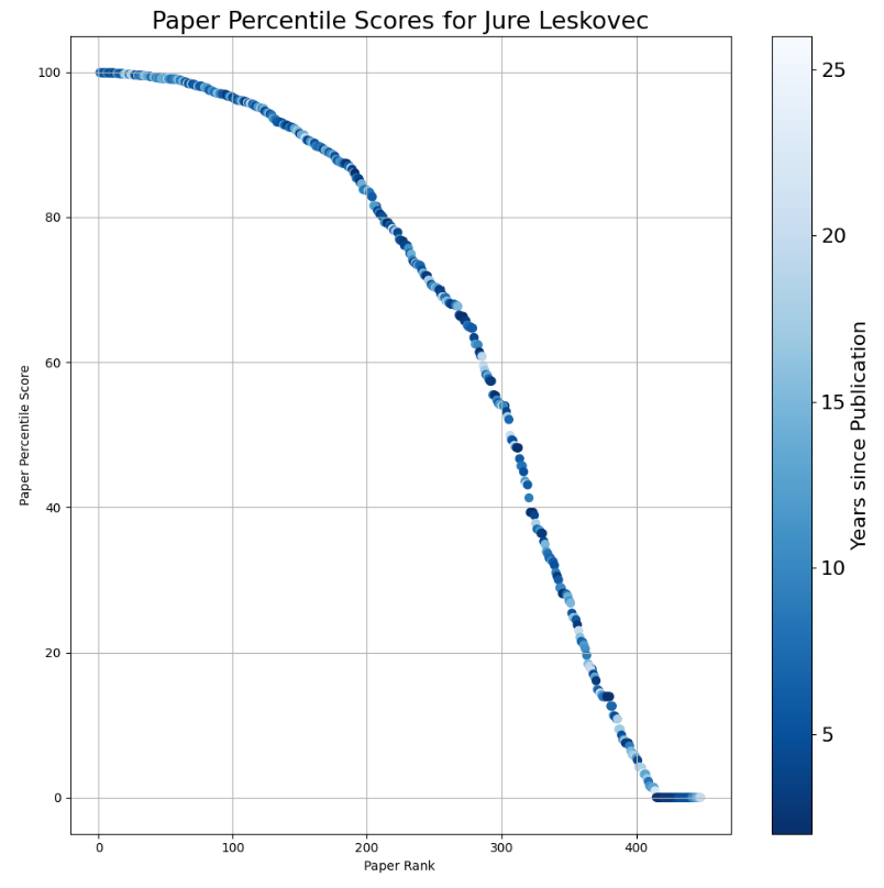
Many years back, we conducted some analysis on how the number of citations for a paper evolves over time. We noticed that while the raw number of citations tends to be a bit difficult to estimate, if we calculate the percentile of citations for each paper, based on the year of publication, we get a number that stabilizes very quickly, even within 3 years of publication. That means we can estimate the future potential of a paper rather quickly by checking how it is doing against other papers of the same age. The percentile score of a paper is a very reliable indicator of its future.
To make it easy for everyone to check the percentile scores of their papers, we created a small app at
https://scholar.ipeirotis.org/
that allows anyone to search for a Google Scholar profile and then calculate the percentile scores of each paper. We then take all the papers for an author, calculate their percentile scores, and sort them in descending order based on their scores. This generates a plot like this, with the paper percentile on the y-axis and the paper rank on the x-axis.
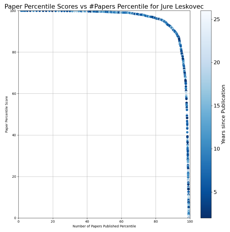
Then, an obvious next question came up: How can we also normalize the x-axis, which shows the number of papers?
Older scholars have more years to publish, giving them more chances to write high-percentile papers. To control for that, we also calculated the percentiles for the papers published, by using a dataset of around 15,000 faculty members at top US universities. The plot below shows how the percentiles for the number of publications evolve over time.

and a less impressive one for yours truly:

Now, with a graph like this, with the x and y axes being normalized between 0 and 1, we have a nice new score that we have given the thoroughly boring name "Percentile in Percentile Area Under the Curve" score, or PiP-AUC for short. It is a score that ranges between 0 and 1, and you can play with different names to see their scores.
At some point, we may also calculate the percentile scores of the PiP scores, but we will do that in the future. :-) UPDATE: If you are also curious about the percentiles for the PiP-AUC scores, here is the distribution:

The x-axis shows the PiP-AUC score, and the y-axis shows the corresponding percentile. So, if you have a PiP-AUC score of 0.6, you are in the top 25% (i.e., 75% percentile) for that metric. With a score of 0.8, you are in the top 10% (i.e., 90% percentile), etc.
In general, the tool is helpful when trying to understand the impact of newer work published in the last few years. Especially for people with many highly cited but old papers, the percentile scores are very helpful for quickly finding the newer gems. I also like the PiP-AUC scores and plots, as they offer a good balance of overall productivity and impact. Admittedly, it is a strict score, so it is not especially bragging-worthy most of the time :-)
(With thanks to Sen Tian and Jack Rao for their work.)